With acknowledgment and sincere thanks to John 'Paddy' Newell of the British & Commonwealth Military Badge Forum for an in-depth forensic analysis. This post presents a one-on-one comparison of genuine versus counterfeit cap badges of the WWI Royal Naval Division Battalions Anson, Drake, Hawke, Hood, Howe and Nelson. Using these annotated photographs provides approximately a 95% confidence level in recognizing a genuine cap badge. Paddy had even taken the time and effort to highlight the specific differentiating features, but due to my technical limitations (read computer illiteracy) combined with the blog page design I'm unable to provide that feature at this time and apologize. This is a significant study and contribution. Contemplate for a moment if a team of knowledgeable individuals (no single person could do it, not even in a lifetime!) could compile an equivalent forensic analysis on the entire contents of both volumes of Kipling & King.
 |
| Anson Copy |
Anson Copy
Letters on ANSON scroll are a lot thinner on the copies, most noticeable on the “N”s.
Upper ends of Nil Desperandum scroll are semi-circular on the copies, more elongated on genuine badges and sharper curves. However a word of caution on this badge. I have had correspondence that questions whether these features, rather than a restrike/reproduction, are from a legitimate die set of an alternate manufacturer. Further information from knowledgeable individuals would be sincerely appreciated.
 |
| Anson Genuine |
Anson Genuine
Upper band of coronet almost touches the band above the jewels on the genuine badges, much larger gap between the 2 bands on the copies. Upper band above jewels is more finely notched than on the copies.
 |
| Drake Copy |
Drake
Copy
Not
marked on badge but there are only 7 lines of longitude on copies, 8 lines on
genuine badges. Less detail on white metal ships on copies. Pennants are
more voided on genuine badges.
 |
| Drake Genuine |
DRAKE tablet lettering much thicker on genuine badges. Scroll ends are also more detailed on genuine badges. Gap between AUXILIO and DIVINO on genuine badges. British Isles more clearly defined on genuine badges.
 |
| Hawke Copy |
Hawke
Copy
Talons
of the bird do not touch the letters R & I on the STRIKE scroll. Shape of bird’s head on
copies more like a pterodactyl, genuine heads are smaller and more rounded.
Left wing on copy has 2 rows of feathers, genuine birds have 3 rows.
 |
| Hawke Genuine |
Hawke Genuine
Lettering on HAWKE tablet much thicker and fills the whole tablet.
Talons of the bird touch the letters R & I on the STRIKE scroll.
Fleur De Lys on genuine badge is more clearly defined.
 |
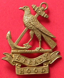
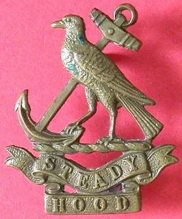
| Hood Copy |
Hood Copy
On copies the bird appears to be standing on a diagonally notched rod.
Lower scroll ends on STEADY scroll are shorter on copies.
Birds eye on copies is much larger than on genuine badges.
 |
| Hood Genuine |
Lettering on STEADY scroll thicker on genuine badges, most noticeable on A & D.
On genuine badges the bird appears to be standing on a rope of 6 distinct sections.
Note difference in the size and shape of talons.
Note difference in the size and shape of talons.
 |
| Howe Copy |
Howe Copy
About 75% of copies have no voiding on sails and so are very easy to identify as fakes. Of the other 25% of copies there is too much voiding. Pennant ends are attached on genuine badges but totally voided on these copies.
 |
| Howe Genuine |
Howe Genuine
Lettering on HOWE scroll thicker on genuine badges.
Upper band of jewel band is more finely notched on genuine badges.
 |
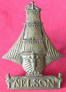
| Nelson Copy |
Nelson Copy
Vertical lines on the left hand side of the 3 sails, no such lines on genuine badges.
8 planks on left hand side of ship on copies. NELSON tablet on copies has smooth background. |
| Nelson Genuine |
Nelson
Genuine
Upper
pennant voided on genuine badges. 9 planks on left hand side of ship on copies.
NELSON tablet on genuine badges has rough (seeded) background. Lettering on
NELSON scroll thicker on genuine badges, most noticeable on Ns & O.
The
author is learning that the complex nuances of this series of badges are
greater than initially thought. For example the following is a series of
photographs of the Howe badge.
Viewing
from left to right the first badge is a genuine die-struck Gaunt marked Howe
badge, the
next badge is believed to be an un-marked die-cast (not struck)
example, also believed to be righteous. The third badge is considered suspect
for the following reasons; the two small circled areas and the comparatively
thicker font in the letters "HOWE".
If any readers have either differing or concurring opinions, and wish to provide comment, you are strongly encouraged to do so.


